Librerías necesarias
Cargar datos
airpoll<-source("chap2airpoll.dat")$value
Boxplots
Boxplot básico
boxplot(airpoll$SO2, ylab="SO2")

Boxplot ggplot
Pára hacer el gráfico necesitamos generar la base de datos en formato “largo”
airpoll2 <- stack(airpoll)
| values | ind |
|---|---|
| 36 | Rainfall |
| 35 | Rainfall |
| 44 | Rainfall |
| 47 | Rainfall |
| 43 | Rainfall |
| 53 | Rainfall |
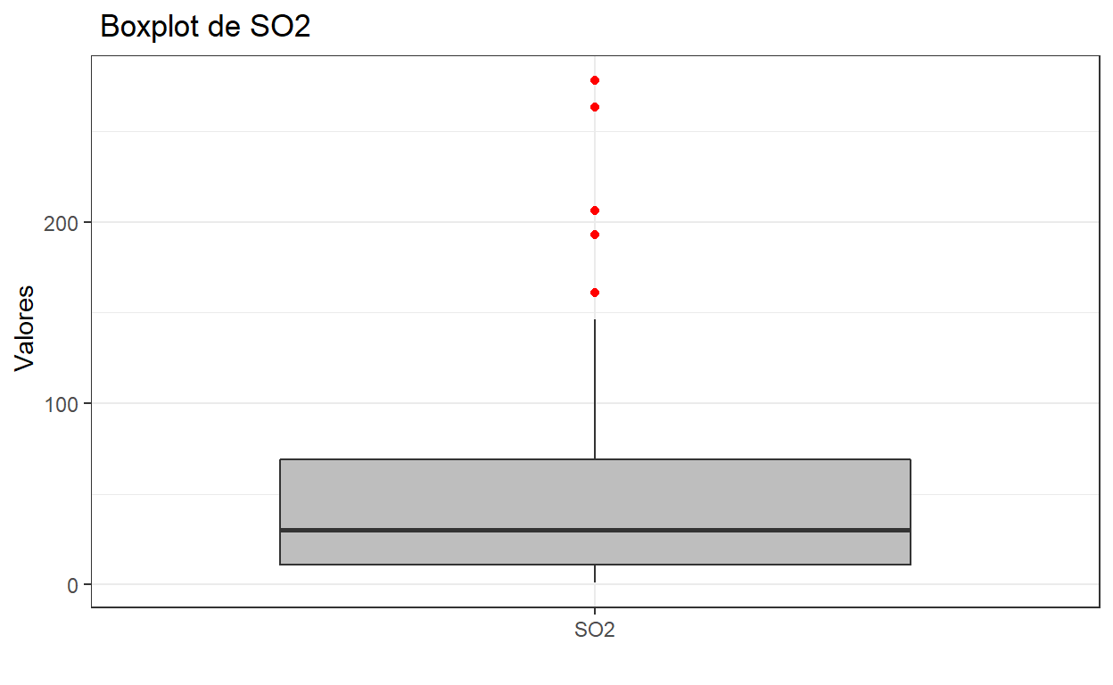
filter(airpoll2, ind == "SO2") %>% #selecciono variable que me importa
  ggplot(aes(x= ind, y= values))+ # Creo la capa de datos
  geom_boxplot(outlier.color = "red", #color de outlier
               fill= "gray")+ # color de la caja
#  geom_text(aes(label= values), position = position_dodge2(0.3))+
  labs(title = " Boxplot de SO2",
       y= " Valores",
       x= "")+
  theme_bw() # el tema que gustes
Más complejo pero con más capácidad de edición
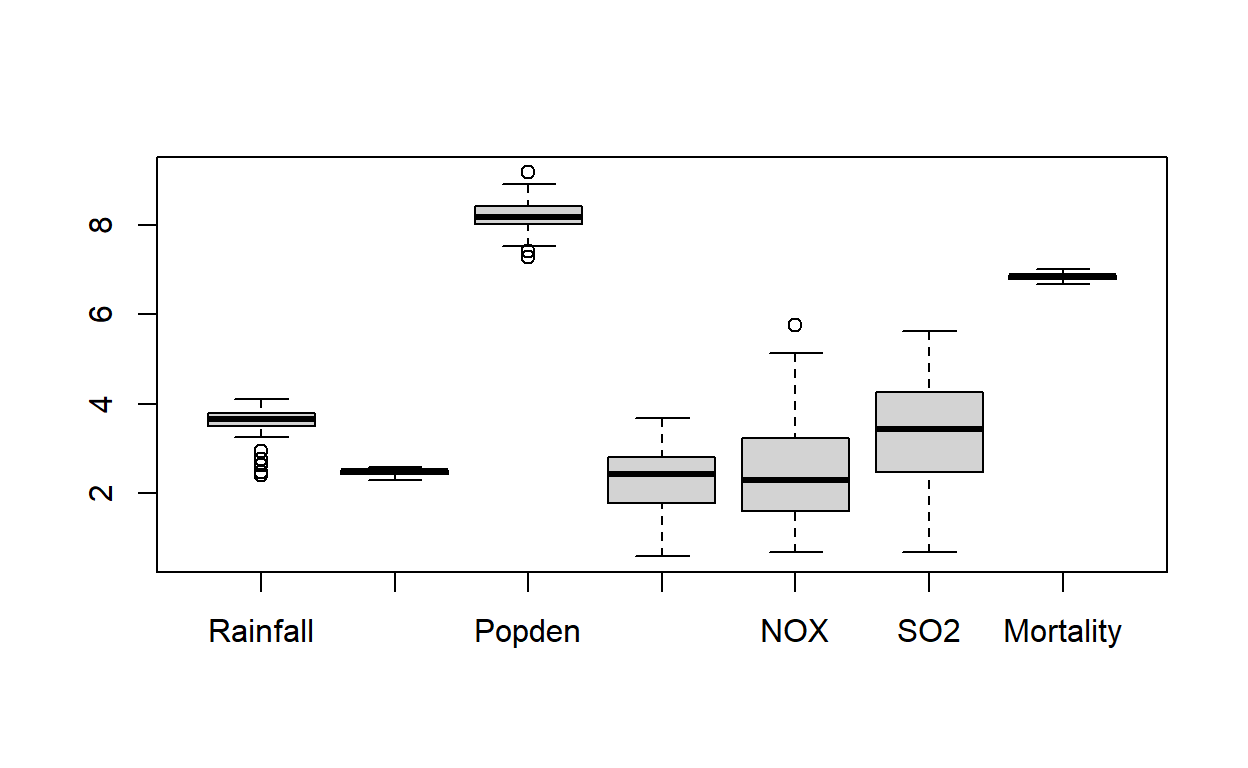
Ahora si queremos gráficar todos los boxplors
Con Base R es sencillo

En ggplot tenemos que usar la base de datos que tenemos en formato “long”
ggplot(airpoll2, aes(x=ind, y= values, fill=ind))+
  geom_boxplot(outlier.colour = "red")+
  #geom_jitter()+ # agregar puntos
  labs(title = "Boxplot Básico", x= "", y= "valores")+
  theme_bw()+
  theme(legend.position = "none") #quitar leyenda de variables

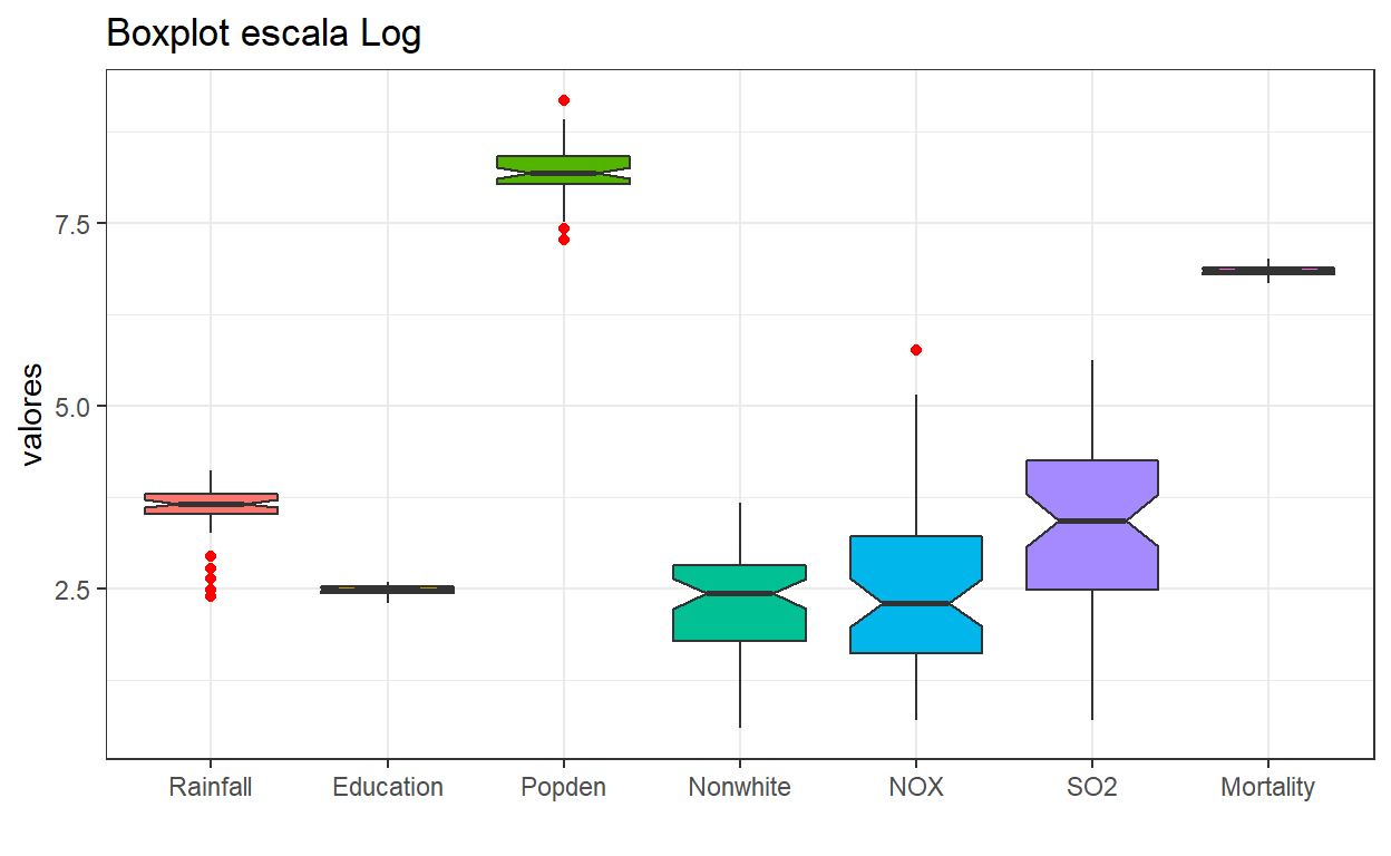
ggplot(airpoll2, aes(x=ind, y= log(values+1), fill=ind))+ #Ahora en log
  geom_boxplot(outlier.colour = "red", notch = T)+
  #geom_jitter()+ # agregar puntos
  labs(title = "Boxplot escala Log", x= "", y= "valores")+
  theme_bw()+
  theme(legend.position = "none") #quitar leyenda de variables
Los gráficos de violín pueden ser útiles también
ggplot(airpoll2, aes(x=ind, y= log(values+1), fill=ind))+
  geom_violin()+ # geometría de violin
  geom_jitter(aes(col= ind), alpha= 0.6)+
    labs(title = "Gráfico de violín",
         x= "", y= "variables scala log")+
  theme_minimal()+
  theme(legend.position = "none") #quitar leyenda de variables

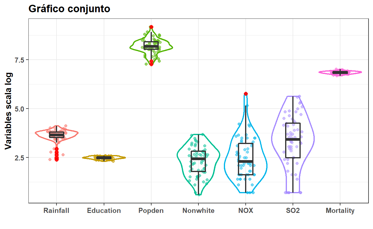
Ahora en conjunto
ggplot(airpoll2, aes(x=ind, y= log(values+1)))+
  geom_jitter( aes(color=ind),width = 0.2, alpha= 0.6)+
  geom_violin(aes(color=ind),
              scale = "width",
              alpha= 0.1, # valor de opacidad
              size= 0.8)+ # tamaño de la linea
  geom_boxplot(width = 0.3, alpha= 0.1, size= 0.8,
               outlier.color = "red",
               outlier.alpha = 0.9,
               outlier.size = 2)+
  labs(title = "Gráfico conjunto",
       x= "", y= "Variables scala log")+
  theme_bw()+
  theme(legend.position = "none", # quitar leyenda de variables
       text = element_text(size= 11, face = "bold")) # Ajustar tamaño de texto
Muchas más opciones en: https://www.r-graph-gallery.com/boxplot.html
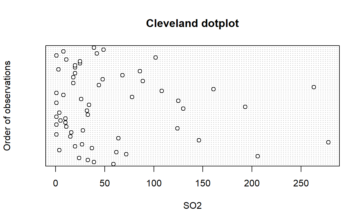
Dotplots
Con base R
dotchart(airpoll$SO2,
         ylab = "Order of observations",
         xlab = "SO2",
         main = "Cleveland dotplot")
Modo ggplot
d_plot <-  airpoll %>%
   mutate(index = seq(n())) %>%
  select_if(is.numeric) %>%
  pivot_longer(cols = !index,
               names_to = "Variable",
               values_to = "Value") %>%
  ggplot(aes(x= Value, y= index, col= Variable))+
  geom_point(size= 2, alpha=0.6)+
  scale_color_viridis_d(option = "mako",
                        begin = 0.1,
                        end = 0.8)+
  facet_wrap(~Variable, scales = "free")+
  labs(y= "Order of ovservation")+
   theme_bw()+
   theme(legend.position = "none",
         text = element_text(size=10))
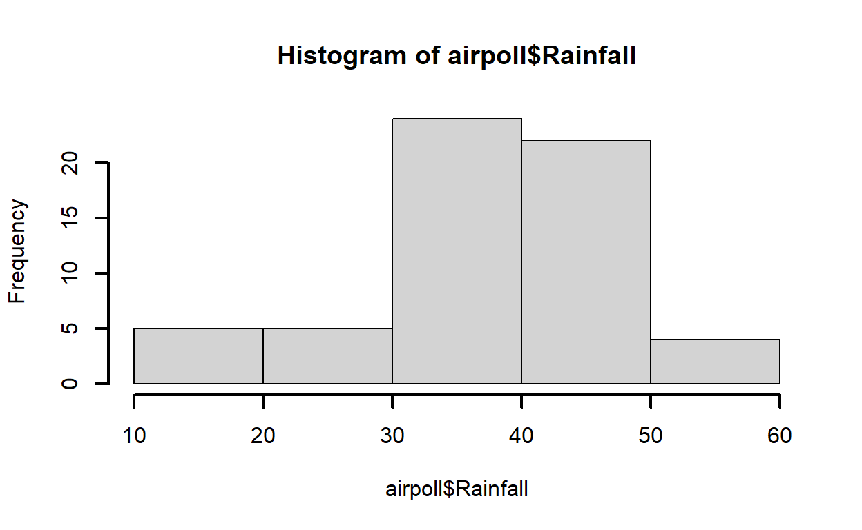
Histogramas
Base R
hist(airpoll$Rainfall,lwd=2)
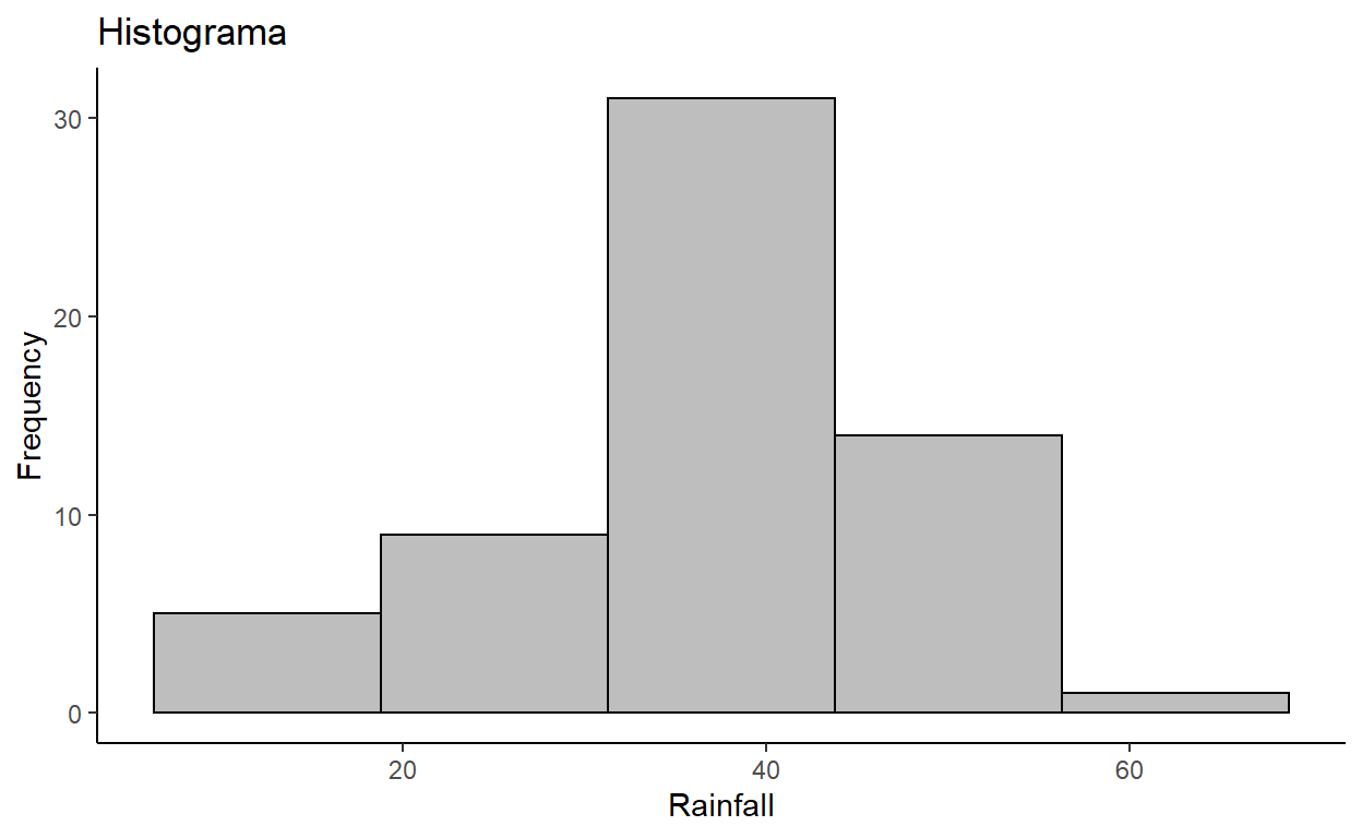
Histograma ggplot
ggplot(airpoll, aes(x=Rainfall))+
  geom_histogram(bins =5, # número de breaks
                 fill= "gray", color= "black")+
  labs(title= "Histograma",
       y= "Frequency")+
  theme_classic()
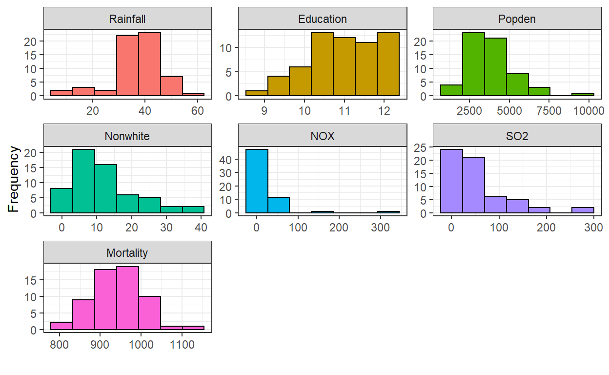
Histograma de todos
Tenemos que usar de nuevo nuestra tabla en formato largo
ggplot(airpoll2, aes(x=values, fill= ind))+
  geom_histogram( bins = 7, color="black")+
  facet_wrap(.~ind, scales = "free")+ # Crear los paneles por variable
  theme_bw()+
  theme(legend.position = "none")+
  labs(x="", y= " Frequency")
Mas opciones en https://www.r-graph-gallery.com/histogram.html
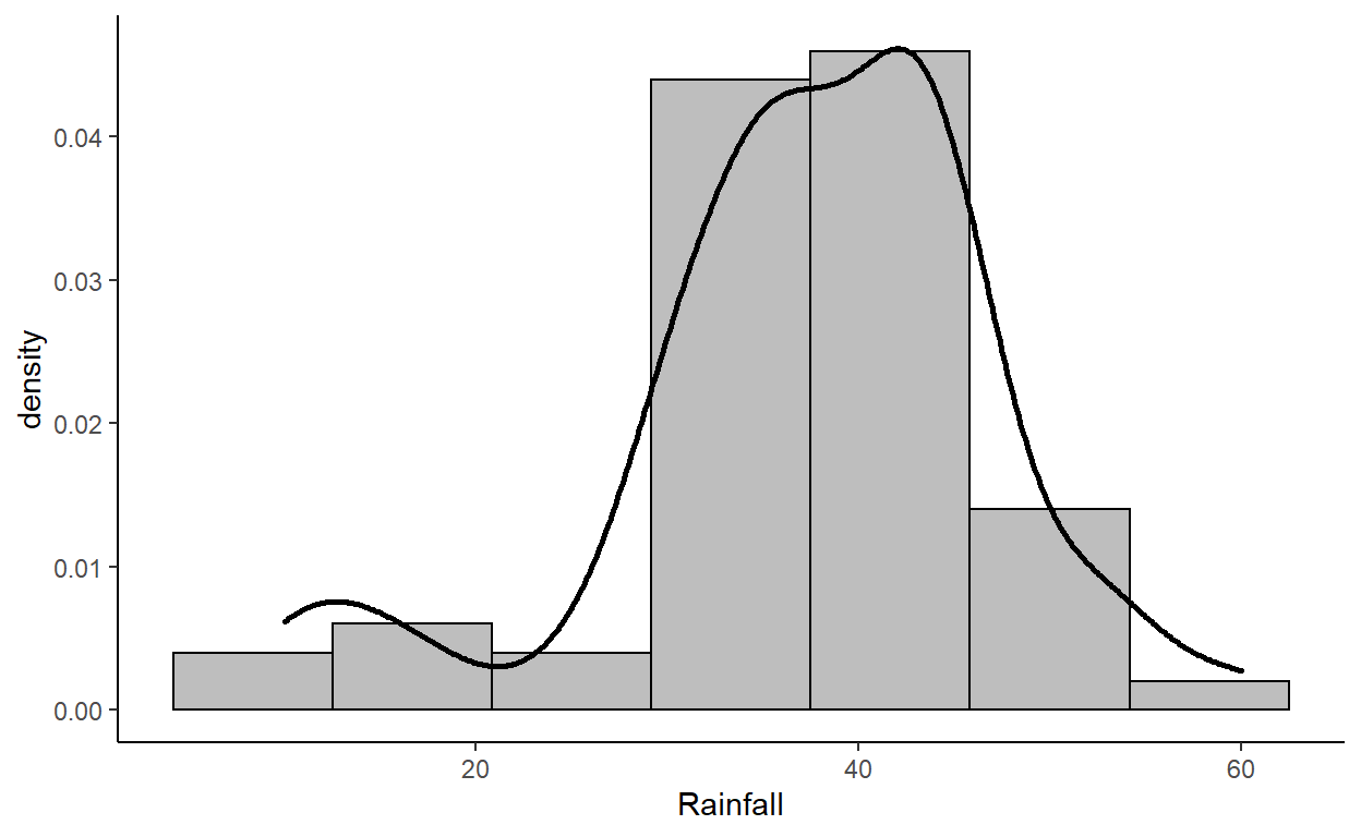
Gráficos de densidad
ggplot de una variable
ggplot(airpoll, aes(x= Rainfall))+
  geom_histogram(aes(y = stat(density)),
                 bins = 7,
                 fill= "gray",
                 color="black")+
  geom_density(size=1)+
  theme_classic()
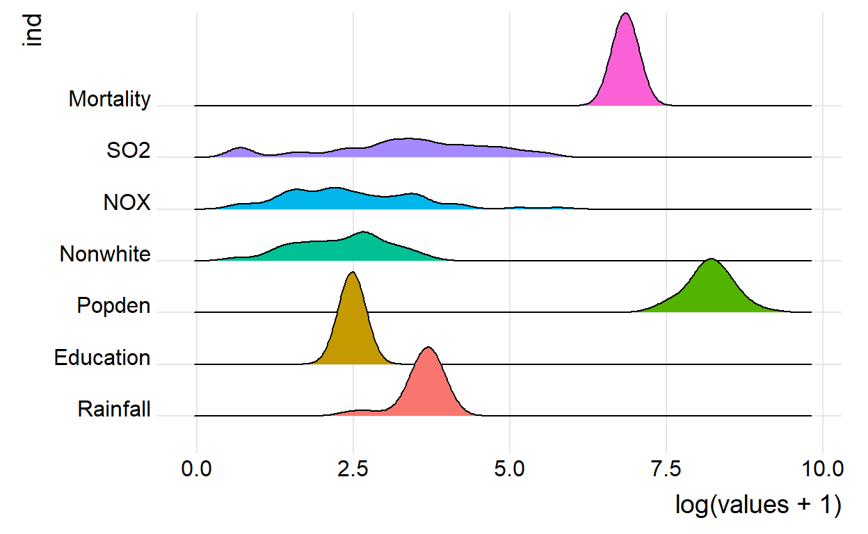
ggplot de todas las variables juntas
ggplot(airpoll2, aes(x=log(values+1), fill= ind))+
  geom_histogram(aes(y = stat(density), fill= ind),
                 bins = 7, color="black")+
  geom_density(aes(fill= ind),
               size=1, alpha= 0.5)+
  facet_wrap(.~ind, scales = "free")+ # Crear los paneles por variable
  theme_classic()+
  theme(legend.position = "none")+
  labs(x="", y= " Frequency")

Variables a la misma escala con un gráfico de olas
ggplot(airpoll2, aes(x= log(values+1), y= ind, fill= ind))+
  geom_density_ridges()+
  theme_ridges() +
  theme(legend.position = "none")
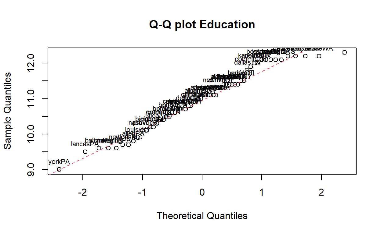
Q-Q plots
Voy a crear una base con una columna que tenga el nombre de las ciudades
airpoll3 <- airpoll %>%
  rownames_to_column(var= "City")
###plot base

Con los labels
Education_plot <- qqnorm(airpoll3$Education, main="Q-Q plot Education")
qqline(airpoll3$Education, col = 2, lty = 2)
text(Education_plot[[1]], Education_plot[[2]], airpoll3$City, pos = 3,
     cex = 0.7)
ggplot de qqplots
ggplot(airpoll3, aes(sample=Education))+
  stat_qq()+
  stat_qq_line(linetype= "dashed")+
  geom_text_repel(label= airpoll3$City[order(airpoll3$Education)],
                  stat = "qq",
                  size= 1.5)+
  labs(title = "Q-Q plot",
       x= "Theoretical Quantiles",
       y= "Education sample cuantiles")+
  theme_bw()

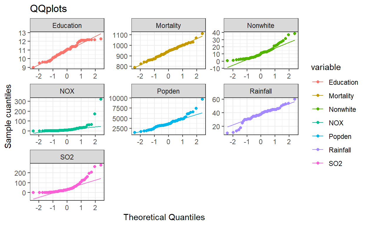
Gráfico conjunto Necesito que mi base de datos este en formato largo junto con la columna de Ciudad
airpoll4 <- airpoll %>%
  rownames_to_column(var= "City") %>% # de nombres a columna
  pivot_longer(cols = c(names(airpoll)), #Las columnas que bajo
               names_to = "variable", # Nombre de la nueva column
               values_to = "valores") # Nombre de col de valores
| City | variable | valores |
|---|---|---|
| akronOH | Rainfall | 36.0 |
| akronOH | Education | 11.4 |
| akronOH | Popden | 3243.0 |
| akronOH | Nonwhite | 8.8 |
| akronOH | NOX | 15.0 |
| akronOH | SO2 | 59.0 |
ggplot(airpoll4, mapping = aes(sample= valores,colour= variable))+
  stat_qq()+
  stat_qq_line()+
  labs(title = "QQplots",
       x= "Theoretical Quantiles",
       y= "Sample cuantiles"
  )+
  facet_wrap(.~variable , scales = "free")+
  theme_bw()
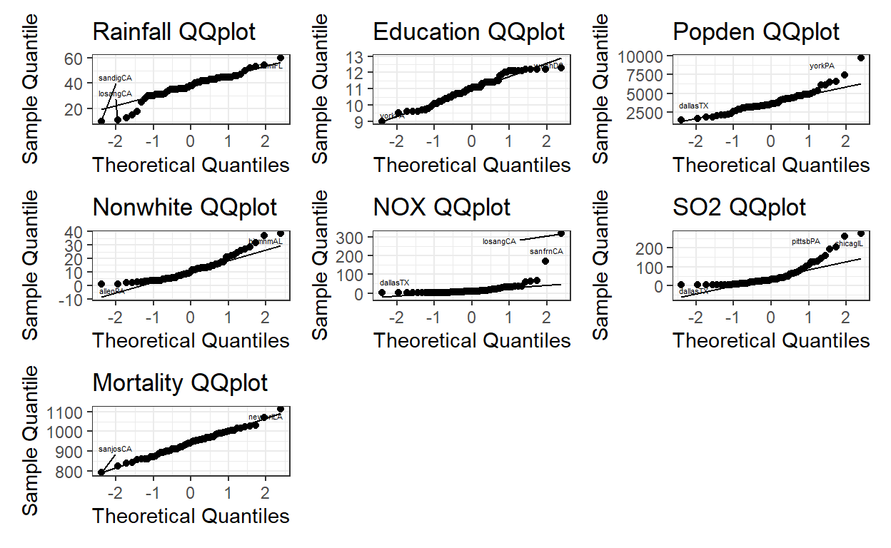
Gráficos conjuntos señalando las ciudades Para este caso tube que crear una función que aplicara el label para cada qqplot
f_ggplot <- function(x){
  airpoll3 <- airpoll3
  n <- names(airpoll3)
  p1 <- ggplot(airpoll3, aes(sample=x))+
    stat_qq()+
    stat_qq_line()+
    geom_text_repel(label= airpoll3$City[order(x)],
                    stat = "qq",
                    size= 1.5)+
    labs(title = "QQplot",
         x= "Theoretical Quantiles",
         y= "Sample Quantile")+
    theme_bw()
}
label_plots <- map(airpoll3, f_ggplot)

(label_plots[[2]]+ ggtitle(paste(names(label_plots[2]), "QQplot")))+
  (label_plots[[3]]+ ggtitle(paste(names(label_plots[3]), "QQplot")))+
  (label_plots[[4]]+ ggtitle(paste(names(label_plots[4]), "QQplot")))+
  (label_plots[[5]]+ ggtitle(paste(names(label_plots[5]), "QQplot")))+
  (label_plots[[6]]+ ggtitle(paste(names(label_plots[6]), "QQplot")))+
  (label_plots[[7]]+ ggtitle(paste(names(label_plots[7]), "QQplot")))+
  (label_plots[[8]]+ ggtitle(paste(names(label_plots[8]), "QQplot")))