library(tidyverse)Module 5: Data Visualization with ggplot2
Introduction
One of the most useful — and fun — things we can do with R is create graphics.
Data visualization can help us:
- understand our data,
- identify patterns,
- detect unusual values,
- compare groups,
- explore relationships,
- and communicate results.
In this module, we will use the package ggplot2.
ggplot2 is part of the tidyverse and uses a consistent system for building graphics by adding different layers.
Download the example data
We will use a camera-trap record table throughout this module.
Let’s get started
Open your intro-r-course project and create a new R script.
Save it inside the scripts folder as:
module-05.RFirst, load the tidyverse package:
Then import the dataset:
recordTable <- read_csv(
  "data/recordTable.csv"
)
Remember that we should always inspect a dataset after importing it.
head(recordTable)# A tibble: 6 × 25
RootFolder File RelativePath Station Camera DateTime Species
<chr> <chr> <chr> <chr> <chr> <dttm> <chr>
1 Field Station 2… DSCF… "Control 0\… Contro… Contr… 2025-05-15 14:53:20 White-…
2 Field Station 2… DSCF… "Control 1\… Contro… Contr… 2025-06-05 04:25:19 Armadi…
3 Field Station 2… DSCF… "Control 1\… Contro… Contr… 2025-06-26 07:39:44 Armadi…
4 Field Station 2… DSCF… "Control 1\… Contro… Contr… 2025-06-26 08:07:20 Armadi…
5 Field Station 2… DSCF… "Control 1\… Contro… Contr… 2025-06-26 08:39:46 Armadi…
6 Field Station 2… DSCF… "Control 1\… Contro… Contr… 2025-07-20 01:11:11 Armadi…
# ℹ 18 more variables: N_individuals <dbl>, Sex <chr>, Age <chr>,
# Identifier <chr>, Comments <chr>, Favorite <lgl>, DateTime_original <dttm>,
# year <dbl>, date_shift <dbl>, n_images <dbl>, Date <date>, Time <time>,
# delta.time.secs <dbl>, delta.time.mins <dbl>, delta.time.hours <dbl>,
# delta.time.days <dbl>, DateTime2 <dttm>, Date2 <date>dim(recordTable)[1] 3898 25names(recordTable) [1] "RootFolder" "File" "RelativePath"
[4] "Station" "Camera" "DateTime"
[7] "Species" "N_individuals" "Sex"
[10] "Age" "Identifier" "Comments"
[13] "Favorite" "DateTime_original" "year"
[16] "date_shift" "n_images" "Date"
[19] "Time" "delta.time.secs" "delta.time.mins"
[22] "delta.time.hours" "delta.time.days" "DateTime2"
[25] "Date2" str(recordTable)spc_tbl_ [3,898 × 25] (S3: spec_tbl_df/tbl_df/tbl/data.frame)
$ RootFolder : chr [1:3898] "Field Station 2025" "Field Station 2025" "Field Station 2025" "Field Station 2025" ...
$ File : chr [1:3898] "DSCF0007.JPG" "DSCF0134.JPG" "DSCF0425.JPG" "DSCF0429.JPG" ...
$ RelativePath : chr [1:3898] "Control 0\\Control 0 A" "Control 1\\Control 1 B" "Control 1\\Control 1 B" "Control 1\\Control 1 B" ...
$ Station : chr [1:3898] "Control 0" "Control 1" "Control 1" "Control 1" ...
$ Camera : chr [1:3898] "Control 0 A" "Control 1 B" "Control 1 B" "Control 1 B" ...
$ DateTime : POSIXct[1:3898], format: "2025-05-15 14:53:20" "2025-06-05 04:25:19" ...
$ Species : chr [1:3898] "White-tailed deer" "Armadillo" "Armadillo" "Armadillo" ...
$ N_individuals : num [1:3898] 0 1 2 1 1 1 1 1 1 1 ...
$ Sex : chr [1:3898] NA "Unknown" "Unknown" "Unknown" ...
$ Age : chr [1:3898] "Unknown" "Adult" "Unknown" "Unknown" ...
$ Identifier : chr [1:3898] NA NA NA NA ...
$ Comments : chr [1:3898] NA NA NA NA ...
$ Favorite : logi [1:3898] FALSE FALSE FALSE FALSE FALSE FALSE ...
$ DateTime_original: POSIXct[1:3898], format: "2025-05-15 14:53:20" "2025-03-08 04:25:19" ...
$ year : num [1:3898] 2025 2025 2025 2025 2025 ...
$ date_shift : num [1:3898] NA 89 89 89 89 89 89 89 89 89 ...
$ n_images : num [1:3898] 1 2 2 1 1 2 1 1 2 1 ...
$ Date : Date[1:3898], format: "2025-05-15" "2025-06-05" ...
$ Time : 'hms' num [1:3898] 14:53:20 04:25:19 07:39:44 08:07:20 ...
..- attr(*, "units")= chr "secs"
$ delta.time.secs : num [1:3898] 0 0 1826065 1656 1946 ...
$ delta.time.mins : num [1:3898] 0 0 30434.4 27.6 32.4 ...
$ delta.time.hours : num [1:3898] 0 0 507.2 0.5 0.5 ...
$ delta.time.days : num [1:3898] 0 0 21.1 0 0 23.7 0 0 27 0 ...
$ DateTime2 : POSIXct[1:3898], format: "2025-05-15 14:53:20" "2025-06-05 04:25:19" ...
$ Date2 : Date[1:3898], format: "2025-05-15" "2025-06-05" ...
- attr(*, "spec")=
.. cols(
.. RootFolder = col_character(),
.. File = col_character(),
.. RelativePath = col_character(),
.. Station = col_character(),
.. Camera = col_character(),
.. DateTime = col_datetime(format = ""),
.. Species = col_character(),
.. N_individuals = col_double(),
.. Sex = col_character(),
.. Age = col_character(),
.. Identifier = col_character(),
.. Comments = col_character(),
.. Favorite = col_logical(),
.. DateTime_original = col_datetime(format = ""),
.. year = col_double(),
.. date_shift = col_double(),
.. n_images = col_double(),
.. Date = col_date(format = ""),
.. Time = col_time(format = ""),
.. delta.time.secs = col_double(),
.. delta.time.mins = col_double(),
.. delta.time.hours = col_double(),
.. delta.time.days = col_double(),
.. DateTime2 = col_datetime(format = ""),
.. Date2 = col_date(format = "")
.. )
- attr(*, "problems")=<pointer: 0x000002c1bf5ffc90> For this module, some of the variables that will be especially useful are:
Station
Species
N_individuals
Age
n_images
Date
Time
The logic of ggplot2
Most graphics in ggplot2 follow the same general structure:
data
  +
aesthetics
  +
geometry
  +
additional layers
In R, this looks like:
ggplot(
  data = data,
  aes(x = variable)
) +
  geom_something()
The function:
ggplot()creates the graphical object.
Inside:
aes()we specify which variables will be represented visually.
Then we add a geometry, or geom, that determines how those variables will be displayed.
For example:
geom_bar()
geom_histogram()
geom_point()
geom_boxplot()
geom_violin()
Each geometry answers a slightly different type of question.
| Geometry | Useful for |
|---|---|
geom_bar() |
Counts among categories |
geom_histogram() |
Distribution of a numeric variable |
geom_point() |
Relationship between two variables |
geom_boxplot() |
Comparing numeric distributions among groups |
geom_violin() |
Visualizing distributions among groups |
I’ll show you the basics, but you can get creative
There are many more options depending on what you want to explore or communicate with your data.
If you want to go further, I recommend visiting these two websites:
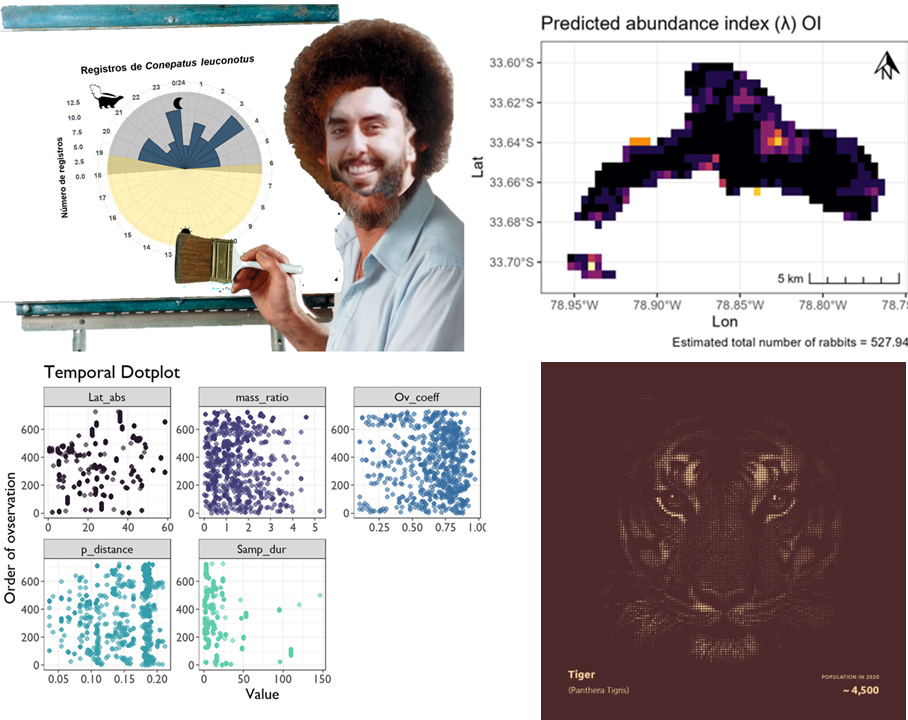
We will explore each of these using our camera-trap data.
Bar plots
Let’s begin with a simple question:
How many records do we have for each species?
Our variable Species contains the species identified in each record.
We can create a bar plot using:
ggplot(
  data = recordTable, # data
  aes(x = Species) #x axis variabe
) +
  geom_bar() # geometry
geom_bar() automatically counts how many observations occur in each category.
Because we have several species, the labels are difficult to read.
We can rotate the plot using:
ggplot(
  data = recordTable,
  aes(x = Species)
) +
  geom_bar() +
  coord_flip() # Rotate the axis
Now each bar represents the number of records for one species.
Adding color
We can change the appearance of the bars by adding a fill argument:
ggplot(
  data = recordTable,
  aes(x = Species)
) +
  geom_bar(fill = "steelblue") +
  coord_flip()
In this case:
fill = "steelblue"does not represent a variable.
We are simply telling ggplot2:
Make all the bars this color.
Labels
A graph should tell the reader what they are looking at.
We can add labels using labs():
ggplot(
  data = recordTable,
  aes(x = Species)
) +
  geom_bar(fill = "steelblue") +
  coord_flip() +
  labs(
    title = "Camera-trap records by species",
    x = "Species",
    y = "Number of records"
  )
We can also add a theme:
ggplot(
  data = recordTable,
  aes(x = Species)
) +
  geom_bar(fill = "steelblue") +
  coord_flip() +
  labs(
    title = "Camera-trap records by species",
    x = "Species",
    y = "Number of records"
  ) +
  theme_bw()
Themes
Themes control the general appearance of a plot.
For example:
theme_bw()theme_classic()theme_minimal()Try replacing theme_bw() with the other themes and see which one you prefer.
Tip
There is no single correct theme.
The most important thing is that the graph is clear and easy to interpret.
Histograms
A histogram helps us visualize the distribution of a numeric variable.
Our dataset contains:
n_imageswhich represents the number of images associated with a record.
Let’s look at its distribution:
ggplot(
  data = recordTable,
  aes(x = n_images)
) +
  geom_histogram()
`stat_bin()` using `bins = 30`. Pick better value `binwidth`.
By default, ggplot2 chooses the number of bins automatically.
We can control this ourselves.
For example:
ggplot(
  data = recordTable,
  aes(x = n_images)
) +
  geom_histogram(
    binwidth = 1,
    fill = "steelblue",
    color = "white"
  ) +
  labs(
    title = "Number of images per record",
    x = "Number of images",
    y = "Frequency"
  ) +
  theme_bw()
The dataset contains a few records with many images, so most observations are concentrated on the left side of the plot.
We can zoom into the first 20 images:
ggplot(
  data = recordTable,
  aes(x = n_images)
) +
  geom_histogram(
    binwidth = 1,
    fill = "steelblue",
    color = "white"
  ) +
  coord_cartesian(
    xlim = c(1, 20)
  ) +
  labs(
    title = "Number of images per record",
    x = "Number of images",
    y = "Frequency"
  ) +
  theme_bw()
Note
Changing the number or width of the bins can change how a histogram looks.
Always experiment with different values before interpreting the pattern.
Aesthetics: mapping versus setting
One of the most important ideas in ggplot2 is the difference between mapping an aesthetic to a variable and setting an aesthetic manually.
For example:
geom_point(color = "steelblue")means:
Make every point steel blue.
But:
geom_point(aes(color = Species))means:
Use different colors to represent different species.
The first is a setting.
The second is a mapping.
The same idea applies to:
color
fill
shape
size
alpha
Selecting some species
Our dataset contains many species.
For some graphics, it will be easier to focus on a few common species.
Let’s create a vector containing five species:
common_species <- c(
  "White-tailed deer",
  "Armadillo",
  "Racoon",
  "Hog",
  "Virginia opossum"
)
Remember what we learned about logical operators and selecting rows?
We can use:
common_records <- recordTable[
  recordTable$Species %in% common_species,
]
Now check:
unique(common_records$Species)[1] "White-tailed deer" "Armadillo" "Hog"
[4] "Racoon" "Virginia opossum" We have created a smaller dataset containing only those species.
Note
We are using base R selection here because we already learned how logical selection works.
Later in the course, we will learn easier ways to filter datasets using dplyr.
Scatterplots
Scatterplots are useful for exploring the relationship between two numeric variables.
For example, we can ask:
Is the number of individuals in a record related to the number of images taken?
We can visualize this using:
ggplot(
  data = common_records,
  aes(
    x = N_individuals,
    y = n_images
  )
) +
  geom_point()
Now let’s map species to color:
ggplot(
  data = common_records,
  aes(
    x = N_individuals,
    y = n_images,
    color = Species
  )
) +
  geom_point() +
  labs(
    title = "Number of individuals and images per record",
    x = "Number of individuals",
    y = "Number of images",
    color = "Species"
  ) +
  theme_bw()
We can make points partially transparent using alpha:
ggplot(
  data = common_records,
  aes(
    x = N_individuals,
    y = n_images,
    color = Species
  )
) +
  geom_point(
    alpha = 0.4,
    size = 2
  ) +
  labs(
    title = "Number of individuals and images per record",
    x = "Number of individuals",
    y = "Number of images",
    color = "Species"
  ) +
  theme_bw()
Lower values of alpha make points more transparent.
This can be useful when many observations overlap.
Shapes
Categorical variables can also be represented using different shapes.
For example:
ggplot(
  data = common_records,
  aes(
    x = N_individuals,
    y = n_images,
    shape = Age
  )
) +
  geom_point(
    size = 3,
    alpha = 0.5
  ) +
  labs(
    title = "Number of individuals and images per record",
    x = "Number of individuals",
    y = "Number of images",
    shape = "Age"
  ) +
  theme_bw()
Warning: Removed 45 rows containing missing values or values outside the scale range
(`geom_point()`).
Here:
shape = Ageis inside aes() because the shape of each point depends on a variable.
Boxplots
A boxplot is useful for comparing the distribution of a numeric variable among groups.
For this example, let’s first calculate the number of records of each species at each camera station:
sp_counts <- recordTable |>
  count(Station, Species) |>
  filter(Species %in% common_species)
Now we can compare how the number of records per station varies among species:
ggplot(
  data = sp_counts,
  aes(
    x = Species,
    y = n
  )
) +
  geom_boxplot() +
  scale_y_log10() +
  coord_flip()
Because the number of records varies considerably among stations, we are displaying the y-axis on a logarithmic scale.
The original values in sp_counts$n are not modified; we are only changing how they are displayed in the graph.
We can also map species to fill:
ggplot(
  data = sp_counts,
  aes(
    x = Species,
    y = n,
    fill = Species
  )
) +
  geom_boxplot(
    show.legend = FALSE
  ) +
  scale_y_log10() +
  coord_flip() +
  labs(
    title = "Camera-trap records per station",
    x = "Species",
    y = "Number of records per station"
  ) +
  theme_bw()
Violin plots
A violin plot is another way of visualizing the distribution of a numeric variable among groups.
ggplot(
  data = sp_counts,
  aes(
    x = Species,
    y = n,
    fill = Species
  )
) +
  geom_violin(
    show.legend = FALSE
  ) +
  scale_y_log10() +
  coord_flip() +
  labs(
    title = "Distribution of records among camera stations",
    x = "Species",
    y = "Number of records per station"
  ) +
  theme_bw()
The width of the violin represents where observations are more concentrated.
Combining geometries
One of the most powerful features of ggplot2 is that we can add multiple geometries as layers.
For example, we can combine a violin plot, a boxplot, and the individual observations:
ggplot(
  data = sp_counts,
  aes(
    x = Species,
    y = n,
    fill = Species
  )
) +
  geom_violin(
    alpha = 0.5,
    show.legend = FALSE
  ) +
  geom_boxplot(
    width = 0.15,
    show.legend = FALSE
  ) +
  geom_jitter(
    aes(color = Species),
    width = 0.15,
    alpha = 0.9,
    show.legend = FALSE
  ) +
  scale_y_log10() +
  coord_flip() +
  labs(
    title = "Distribution of records among camera stations",
    x = "Species",
    y = "Number of records per station"
  ) +
  theme_bw()
Each new + adds another layer to the graphic.
This is the basic logic behind ggplot2.
data
  +
aesthetics
  +
geometry
  +
geometry
  +
geometry
  +
labels
  +
theme
Which geometry should I use?
The graph should depend on the question and the type of variables you have.
One categorical variable
For example:
SpeciesA bar plot can show the number of observations:
geom_bar()One numeric variable
For example:
n_imagesA histogram can show its distribution:
geom_histogram()Two numeric variables
For example:
N_individuals
n_images
A scatterplot can show their relationship:
geom_point()One categorical and one numeric variable
For example:
Species
n_images
We can compare distributions using:
geom_boxplot()or:
geom_violin()
Important
Do not choose a graph just because it looks nice.
Start by asking:
What variables do I have, and what do I want to show?
Saving a plot
We will often want to save a figure so that we can use it in a report, presentation, poster, or manuscript.
First, we can save the entire plot as an R object:
species_plot <- ggplot(
  data = recordTable,
  aes(x = Species)
) +
  geom_bar(
    fill = "steelblue"
  ) +
  coord_flip() +
  labs(
    title = "Camera-trap records by species",
    x = "Species",
    y = "Number of records"
  ) +
  theme_bw()
To display the plot:
species_plot
Then we can save it using ggsave():
ggsave(
  filename = "outputs/species_records.png",
  plot = species_plot,
  width = 8,
  height = 6,
  dpi = 300
)
This will create:
outputs/species_records.pngBecause we are using our RStudio Project, the figure will be saved directly inside the outputs folder.
Tip
Saving a plot through code makes the figure reproducible.
If you later change your data or your graphic, you can simply run the code again.
The basic ggplot2 workflow
Most of the graphics we created followed the same logic:
ggplot(
  data = my_data,
  aes(
    x = x_variable,
    y = y_variable
  )
) +
  geom_something() +
  labs() +
  theme_something()
You do not need to memorize every geom, argument, color, or theme.
What matters is understanding how the pieces fit together.
Practice at home
Tip
This activity should take approximately 20–30 minutes.
Open your intro-r-course project and create a new script called:
practice-05.RSave it inside the scripts folder.
Load tidyverse and import:
data/recordTable.csvPart 1: Bar plot
Create a bar plot showing the number of records for each Species.
Your graph should include:
- a title,
- labels for both axes,
- a color of your choice,
- and a theme.
Try both the regular orientation and:
coord_flip()Decide which version is easier to read.
Part 2: Histogram
Create a histogram of:
n_imagesTry at least three different values for either:
binsor:
binwidthHow does changing the bins affect the appearance of the distribution?
Part 3: Compare species
Create an object containing these three species:
practice_species <- c(
  "White-tailed deer",
  "Armadillo",
  "Hog"
)
Select only those records:
practice_records <- recordTable[
  recordTable$Species %in% practice_species,
]
Create either:
geom_boxplot()or:
geom_violin()to compare n_images among the three species.
Part 4: Scatterplot
Using practice_records and geom_points create a scatterplot with:
N_individualson the x-axis and:
n_imageson the y-axis.
Map:
Speciesto either color or shape.
Experiment with:
size
alpha
until the plot is easy to read.
Part 5: Save a figure
Choose one of your plots, save it as an R object, and export it into:
outputs/using:
ggsave()
Suggested solution
# Practice for Module 5

library(tidyverse)

recordTable <- read_csv(
  "data/recordTable.csv"
)


# ---------------------------
# Bar plot
# ---------------------------

ggplot(
  recordTable,
  aes(x = Species)
) +
  geom_bar(
    fill = "steelblue"
  ) +
  coord_flip() +
  labs(
    title = "Camera-trap records by species",
    x = "Species",
    y = "Number of records"
  ) +
  theme_bw()


# ---------------------------
# Histogram
# ---------------------------

ggplot(
  recordTable,
  aes(x = n_images)
) +
  geom_histogram(
    binwidth = 1,
    fill = "steelblue",
    color = "white"
  ) +
  coord_cartesian(
    xlim = c(1, 20)
  ) +
  labs(
    x = "Number of images",
    y = "Frequency"
  ) +
  theme_classic()


# ---------------------------
# Select species
# ---------------------------

practice_species <- c(
  "White-tailed deer",
  "Armadillo",
  "Hog"
)

practice_records <- recordTable[
  recordTable$Species %in% practice_species,
]


# ---------------------------
# Boxplot
# ---------------------------

ggplot(
  practice_records,
  aes(
    x = Species,
    y = n_images,
    fill = Species
  )
) +
  geom_boxplot(
    show.legend = FALSE
  ) +
  labs(
    x = "Species",
    y = "Number of images"
  ) +
  theme_bw()


# ---------------------------
# Scatterplot
# ---------------------------

ggplot(
  practice_records,
  aes(
    x = N_individuals,
    y = n_images,
    color = Species
  )
) +
  geom_point(
    alpha = 0.5,
    size = 2
  ) +
  labs(
    x = "Number of individuals",
    y = "Number of images",
    color = "Species"
  ) +
  theme_bw()


# ---------------------------
# Save a plot
# ---------------------------

species_plot <- ggplot(
  recordTable,
  aes(x = Species)
) +
  geom_bar(
    fill = "steelblue"
  ) +
  coord_flip() +
  labs(
    title = "Camera-trap records by species",
    x = "Species",
    y = "Number of records"
  ) +
  theme_bw()

ggsave(
  filename = "outputs/species_records.png",
  plot = species_plot,
  width = 8,
  height = 6,
  dpi = 300
)
Your plots do not need to look exactly like these.
The important thing is that you practice:
- choosing an appropriate geometry,
- mapping variables with
aes(), - changing colors, shapes, size, and transparency,
- adding labels and themes,
- and saving your plots.